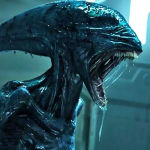
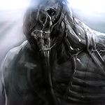
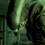
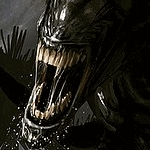
Alien: Covenant was host to a multitude of concepts and designs throughout its preproduction phase that were left on the cutting room floor. Previously, we've highlighted some of the creature designs created by various concept artists and for the most part the designs we've seen were pretty close to what the final versions of Covenant's new aliens looked like. However today, we're highlighting some of the more unorthodox concepts created for the Prometheus sequel, particularly pertaining to the Neomorph.
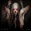
Visual effects company MPC provided a ton of concept work for Alien: Covenant, along with storyboards and some of the concepts they created introduced dramatically different takes on the film's new Alien. Kicking off this list is a design more conventional to the franchise and one that resembles Prometheus' Engineer-born Deacon in appearance.
Deacon Design


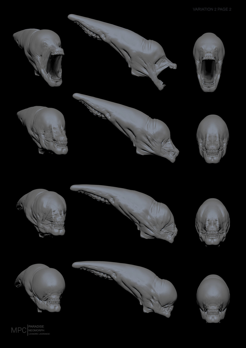
The Goblin Shark inner jaw design remained but was only really visible when Oram shot and killed the final Neomorph in the film. Beyond that scene the inner jaw was not prominently featured.
The next concept is where the Neomorph took an unexpected turn throughout its design phase. Sporting a less Xenomorph / Humanoid structure, the following concept incarnate the Neomorph as more of an insect, one design even being labeled "Neomorph Grub".
Insectoid Design


Further storyboards showed the Neomorph as more like a Spider or Crab in appearance, with a retractable head much like the Xenomorph Queen.
Multiple Heads & Legs Design


Building on the insect concept, this next unused Neomorph design depicted the spore spawn alien as having multiple posterior limbs, again like a spider. The head as well featured a very different look to what it eventually became.
Insectoid with Posterior Limbs Design

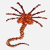
Taking things one step further, another unorthodox design for the Neomorph at one point resembled that of the Trilobite from Prometheus - ditching the exoskeletal structure and replacing it with a more invertebrate design. This version of Neomorph had tentacles.
Trilobite Design

As with the alternate designs of the Neomorph, there were also a number of birthing sequence concepts which went unused as well. Though, many will agree the Backbursting sequence and the Throatbursting sequence were grotesque and shocking, there were a few unused birthing sequences that would have also elicited some unease if realized on film.
Alternarive Bursting Methods


You'll notice the above concepts show the Neomorph bursting with tentacles. This concept was dropped in favor of a fetal Neomorph bursting using it's spikes or by ejection using an embryonic sack.
What do you think of these unused concepts? Would you have liked to see any of these realized on film? Let us know your opinion in the comments section below!
The Alien: Romulus sequel is currently in development and cameras are set to roll by October, 2025! Be sure to bookmark the Alien: Romulus 2 Info Page for an up-to-date account of all available information, production updates and important details! You can also share any news & rumours we may have missed by starting your own discussion in our forums!
In addition to the upcoming Alien: Romulus sequel, we have the Alien: Earth TV series from Noah Hawley arriving this August and a rumoured Alien vs. Predator reboot in the works as well after it was revealed Weyland-Yutani play a key role in the upcoming Predator: Badlands movie! There's really never been a better time to be a fan of the Alien movies. Be sure to check out our image galleries for the latest images, posters, concept art and leaked materials for all these upcoming Alien projects!


